English version below.
In corso: 2021-presente
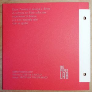
“l’autore si arroga il diritto di scrivere un libro sulla sua esperienza di lettore pur non essendo altri che un guitto”
Saulo Lucci
Vi abbiamo chiesto di accompagnare l’attore Saulo Lucci all’Inferno.
Detta così può sembrare uno scherzo o una minaccia, ma è proprio ciò che abbiamo fatto: The Paper Lab ha chiesto di aggiungere la vostra mano di lettori, amatori, frequentatori o curiosi della Selva Oscura per far (ri)veder le stelle a “Nel mezzo di un gelido Inferno”, l’opera di Saulo; e lo abbiamo fatto tramite il crowdfuning su Produzioni dal Basso.
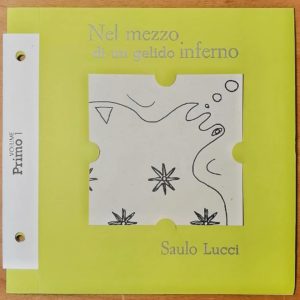
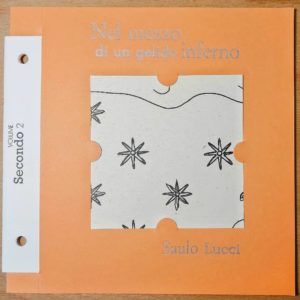
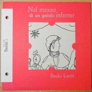
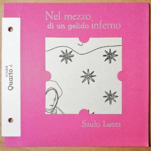
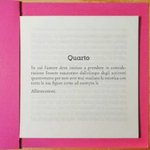
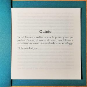
Saulo ci parla di Dante, ma non lo fa commentando la Commedia, ci racconta la sua esperienza di lettore e di studioso dell’oera: lo fa tramite 34 fascicoli (17 x 15 cm) stampati, tagliati e assemblati a mano nei laboratori di The Paper Lab e dell‘Archivio Tipografico. Ci rifacciamo alla tradizione dei Feuilleton di metà ‘800 che uniti potranno formare un volume unico tenuto insieme da due bulloni.
Sono 34, come gli spettacoli di Hell o’Dante, tanti quanti i canti dell’Inferno, realizzati con una profonda attenzione tecnica. Noi riserviamo la stessa attenzione nel rendervi partecipi del processo produttivo di questa fantastica opera mostrandovi il percorso che abbiamo compiuto per poter districare il prodotto dalla Selva Oscura.
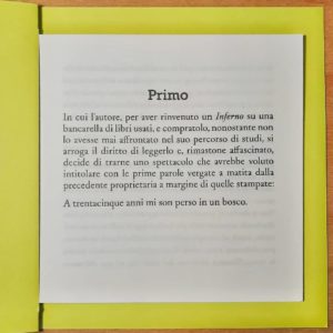
Il progetto grafico infatti vuole il Poeta coinvolto nell’impaginato definitivo, dove può inserire glosse laterali: è Dante a commentare lo scritto e l’esperienza di Saulo, a scrivere pensieri di getto direttamente sul testo. Per distinguere le due personalità sono stati applicati due font differenti, scelti accuratamente per delinearne le caratteristiche e ruolo.
Il progetto tecnico invece ha inizio da un prototipo realizzato con sfridi tipografici con la politica del no-waste e dell’economia circolare. Francesca Pavese è la nostra graphic designer che ha progettato sia l’impaginazione “dialogica” e lo stile grafico del testo, che l’aspetto aggregativo del corpus dei fascicoli:
“Prende spunto dal libro imbullonato di Fortunato Depero dove le pagine possono essere estrapolate e vivere di natura propria. Lo stesso vale per i fascicoli della raccolta, vivono singolarmente e insieme concepiscono un’opera unica.”
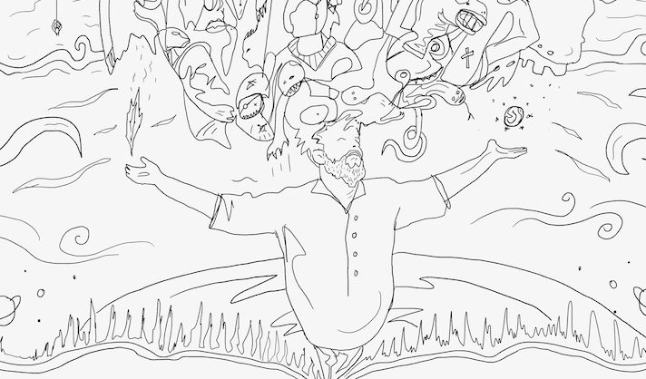
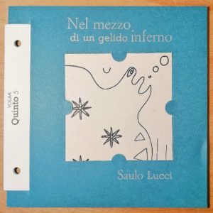
Ovviamente si tratta di un opera ricombinante, non a caso ogni fascicolo ha la copertina adornata da un disegno removibile e incorniciabile singolarmente ma si potrà poi combinare con tutti gli altri 34 fino ad assumere la forma finale e definitiva: un’illustrazione unica dell’artista Davide Fasolo. La sua è una mappa evocativa in cui figure e fondo si connettono reciprocamente, con Saulo al centro e i suoi pensieri danteschi che esplodono e si fondono tra loro.
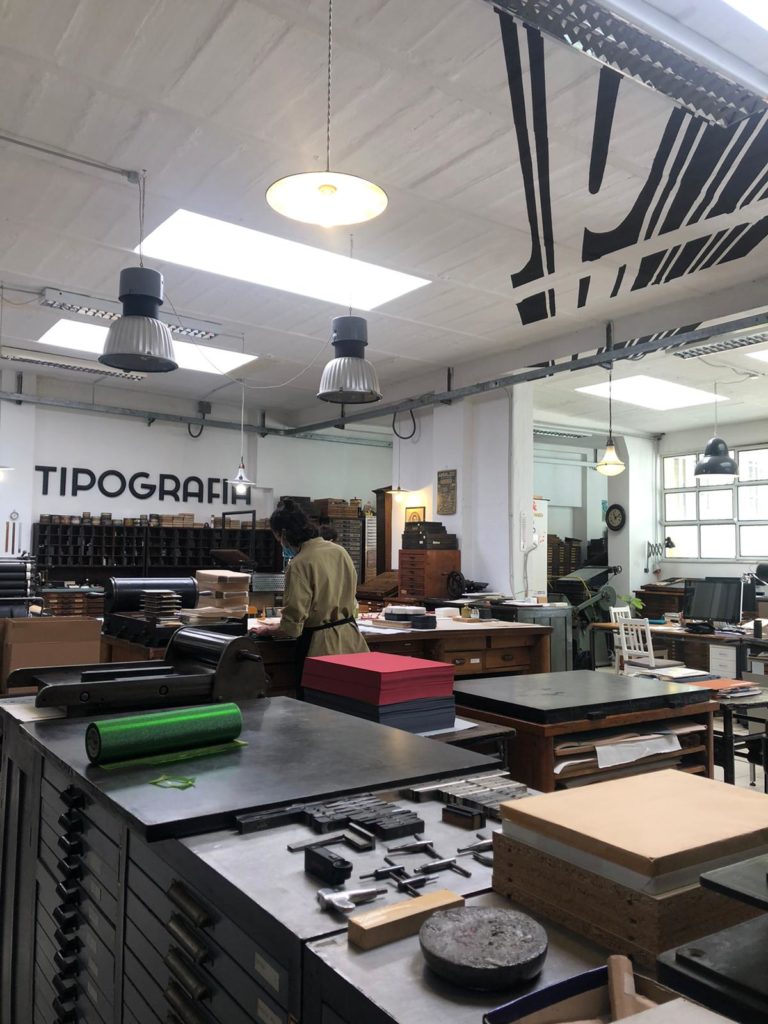
Assieme all’artista ci siamo recati all’Archivio Tipografico dove sono raccolti i macchinari dismessi alla chiusura delle grandi tipografie storiche di Torino, un luogo in cui convivono 3000 cassetti con font a caratteri mobili e avanzate tecnologie di stampa tipografica.
Qui abbiamo deciso, sotto consiglio di Davide, di usare una tecnica ibrida di stampa.
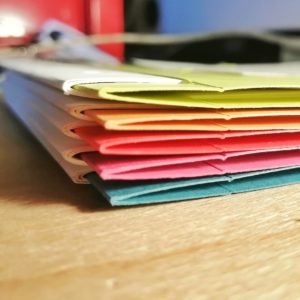
Abbiamo quindi stampato su carta Fedrigoni Arena da 120 grammi le pagine interne con una macchina centenaria ma con un cliché in plastica per sfruttare le caratteristiche dell’impaginazione digitale e ottenere un effetto grana, mantenendo una qualità tipografica simile a quella usata per la composizione a caratteri mobili.
Le copertine invece sono realizzate in carta Woodstock Fedrigoni di 260 grammi.
Desideri acquistarli? contataci via Whatsapp o Telegram al 3755455848 o compilando questo form
English version.
“In the middle of a freezing hell” In hell with Saulo Lucci, Davide Fasolo and The Paper Lab
“the author arrogates to himself the right to write a book about his experience as a reader, even though he is no more than a strolling player”
Saulo Lucci
We asked you to accompany the actor Saulo Lucci to Hell
It may sound like a joke or a threat, but that’s exactly what we did: The Paper Lab asked to add your hand as readers, amateurs, frequenters or curious of the Selva Oscura (“dark forest”) to be able to (re)view the stars “in the middle of a freezing hell”, Saulo’s work; and we did it through the crowdfuning on Produzioni dal Basso.
Saulo talks us about Dante, but he doesn’t do it by commenting the Comedy, he tells us about his experience as a reader and as scholar of the opera: he does it through 34 printed files (17 x 15 cm), cutted and assembled by hand in the laboratories of The Paper Lab and of the Archivio Tipografico. We take up the tradition of the Feuilleton of the mid-nineteenth century, that together could form a single volume held together by two bolts.
There are 34 of them, like Hell o’Dante shows, as many as the canti (chapters) of Hell, produced with great technical care. We reserve the same attention in making you participate in the production process of this amazing opera, showing you the path we have taken to untangle the product from the Dark Forest.
In fact, the graphic project wants the Poet involved in the final layout, where he can insert lateral glosses: it is Dante who comments on Saulo’s writing and experience, writing thoughts directly on the text. To distinguish the two personalities, two different fonts were applied, carefully chosen to outline their characteristics and roles.
The technical project, on the other hand, starts with a prototype made from typographic waste with a no-waste and circular economy policy. Francesca Pavese is our graphic designer who designed both the “dialogic” pagination and the graphic style of the text, and the aggregative aspect of the body of the dossiers:
“It takes its cue from Fortunato Depero’s bolted book where the pages can be extrapolated and live of their own nature. The same is applied to the fascicles in the collection, they live individually and together they conceive a unique work.”
Obviously it’s about a recombinant work, and it is no coincidence that each dossier has a cover adorned with a drawing that can be removed and framed individually, but can then be combined with all the other 34 until it takes on its final and definitive form: a unique illustration by the artist Davide Fasolo. His is an evocative map in which figures and background connect with each other, with Saul at the centre and his Dantean thoughts exploding and merging with each other.
Together with the artist, we went to the Archivio Tipografico (Typographical Archive) where the machineries abandoned when the great historical printing houses of Turin closed down are collected, a place where 3000 drawers with movable type fonts and advanced typographic printing technologies coexist. Here we decided, on Davide’s advice, to use a hybrid printing technique.
We therefore printed the inside pages on 120 gram Fedrigoni Arena paper using a century-old machine but with a plastic plate to exploit the characteristics of digital pagination and obtain a grain effect, while maintaining a typographic quality similar to that used for movable type. The covers, on the other hand, are made of 260 gram Fedrigoni Woodstock paper.
Would you like to buy them? Contact us via Whatsapp or Telegram at 3755455848 or by filling out this form.
English translation: Maria Grazia Ronchi